Refreshing Brand Update
Lemonade LA may have started in Southern California, but when they decided to expand their reach to Northern California and beyond, they realized that they also needed to update and refine their overall brand too. Their company was growing a lot, so their brand needed to grow with them.
They already had a strong local following, so they didn’t need to reinvent the wheel. So we stayed close to their original identity and general brand elements, but we created a tight system for how those elements could evolve and how they should be used. We also added a bit more personality and created thorough guidelines to help them be as consistent as possible with how their brand is expressed as they continue to grow and expand. For the logo, we stayed true to the script style, but re-drew the entire word mark to feel more mature, legible, and consistent. As an extension of the brand, we also designed signage and custom packaging.
Client: Lemonade LA
Studio: Rapt
Creative Direction: Lucia Matioli
Art Direction: Sam Gray
Design Lead: Chris Cowans
Design: Chris Cowans, Andrea Hsieh
Product Design: Adam Weaver
Redrawn With Precision
The original Lemonade logo had a hand drawn look, with thin, wobbly, cursive lettering. They did this intentionally as part of their original identity, which was inspired by a more childlike lemonade stand. But as the company grew and matured, they knew that their logo and brand needed to as well. So, I redrew their logo completely with thicker, smoother, and more confident line work. Another way to help it feel more mature was to make sure the angle of the lettering was consistent. So, all of the lettering was drawn using the same alignment.
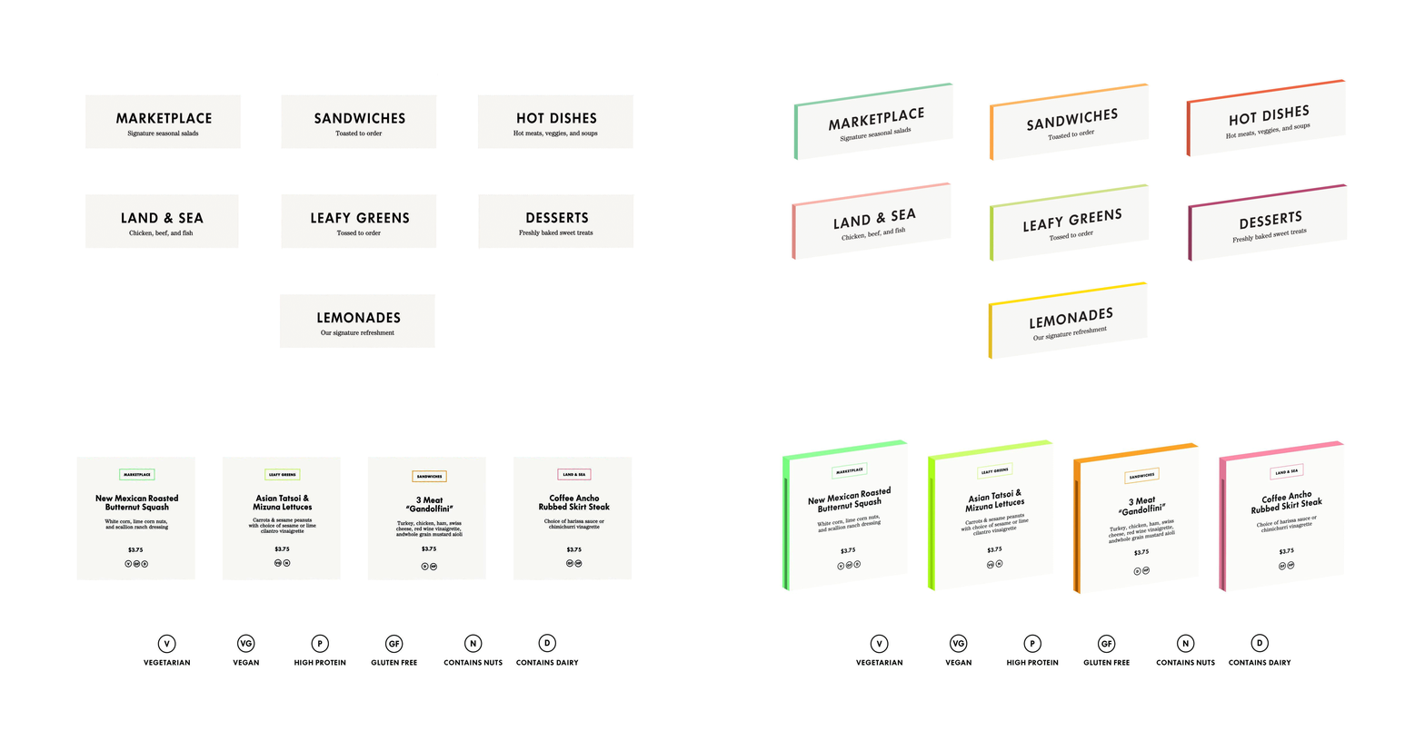
Custom Menus
All menus were designed with edge painting to help differentiate the various food options and categories as people move from one station to another and select their food. A simple typographic icon system was also designed to indicate food restrictions and dietary preferences associated with various food options.


