Rethinking Dentistry
Lydian Dental does things differently. They’re rethinking the industry, so their rebrand had to do the same. They wanted a brand that would feel playful enough to lighten the mood of the industry, but refined enough to be taken seriously. They work hard and play hard, but at the end of the day, they just want to make people smile. So we created a brand to help them do that.
Client: Lydian Dental
Studio: Rapt
Creative Direction: Sam Gray
Design: Chris Cowans, Andrea Hsieh
Illustration: Andrea Hsieh
Product Design: Adam Weaver
Color & Photography
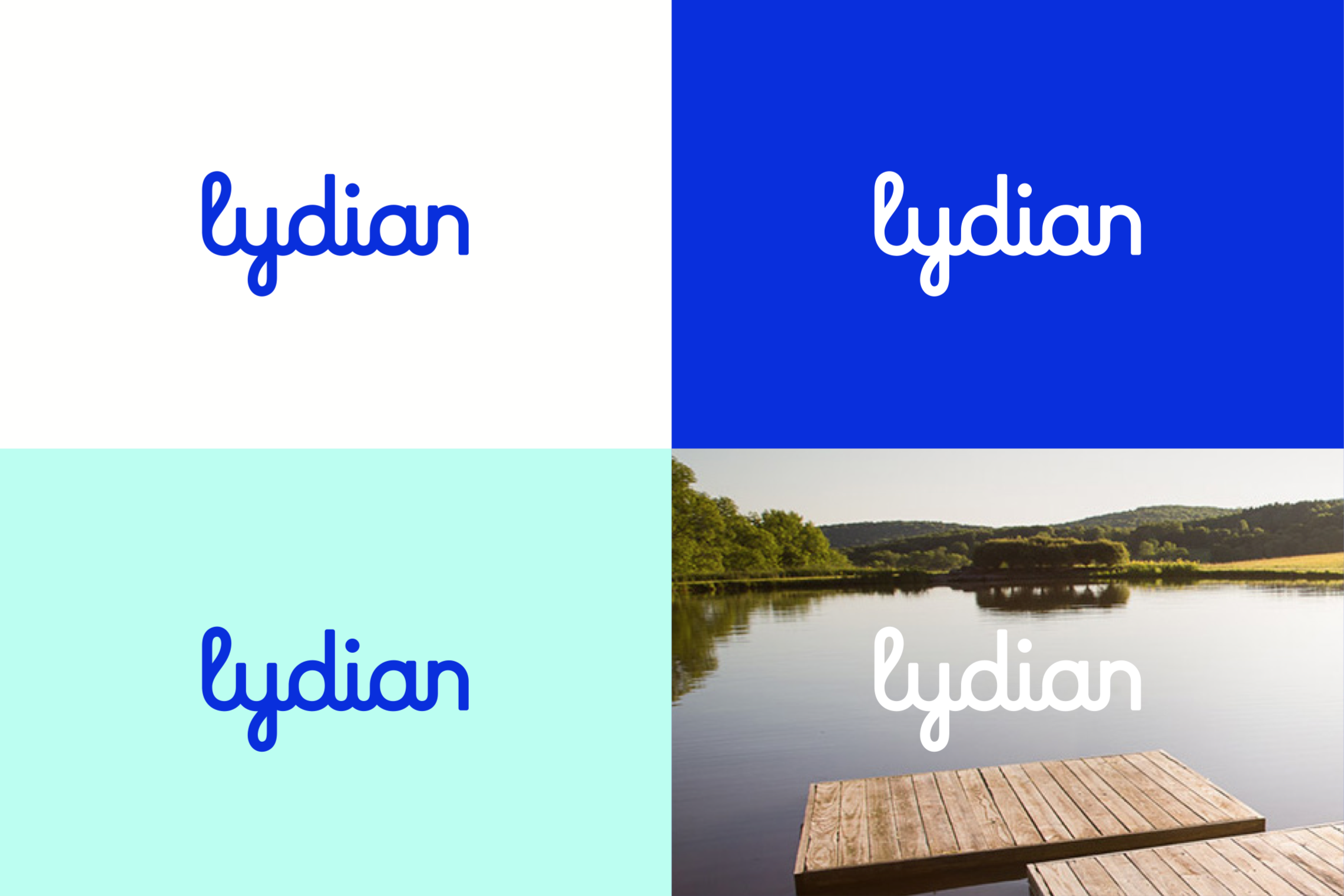
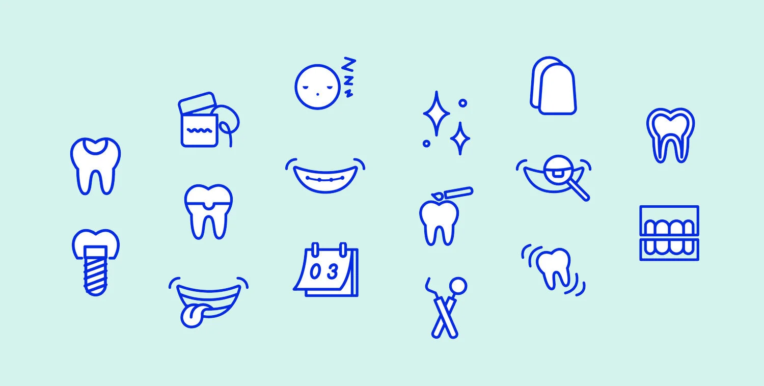
Bright, friendly colors of blue and teal are used as accents throughout the brand system. Sometimes they are used more minimally for the logo, text, icons, and illustrations. Sometimes they are used as full color backgrounds to create more of a bright playful moment or call to action.
The photography used throughout the brand system is warm, friendly, and human. Sometimes it’s more peaceful and relaxing, and other times it’s more playful and quirky – but it’s always natural.
SWAG
A variety of swag was designed and produced as part of Lydian’s rebrand. This includes toothbrushes, toothpaste, floss, water bottles, tote bags, shirts, and more.


