Beacon of Diversity
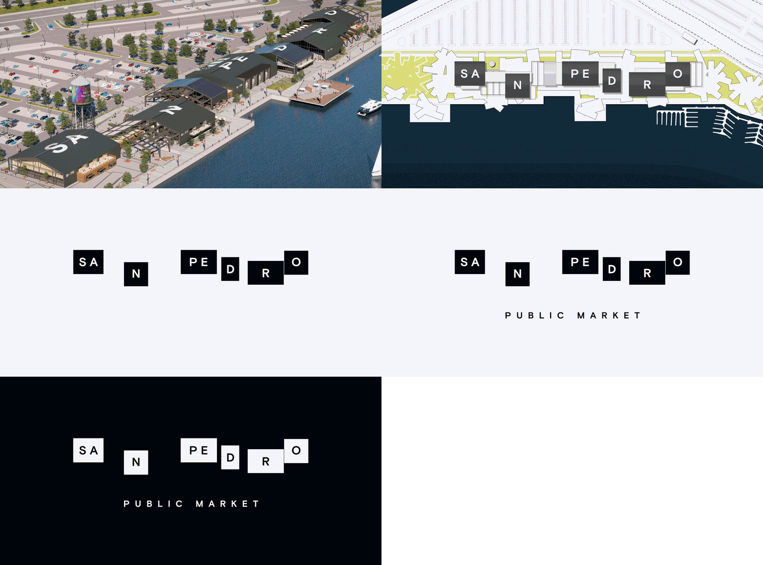
The City of San Pedro, CA is known for its diversity and rich culture. They needed to redevelop their Public Market area near the LA Waterfront and I was asked to help lead the branding effort by designing a unique overarching identity for the site, with special moments that would act as a “beacon” for the city. It needed to be designed in a way that would seamlessly integrate with the architecture and other features that were being designed and built for the site, while also acting as a reflection of the diverse community and history of San Pedro.
These are concepts for a logo, signage, and art installations that were designed to create a multi-faceted identity for the San Pedro Public Market. The spacial identity as a whole highlights the strength and beauty of diversity and demonstrates the importance of coming together to create something bigger than the sum of its parts. The goal was to create a unique identity and authentic experience that would feel true to the local community, while also creating something new and engaging, acting as a beacon that could attract people from the greater LA area and beyond.
Client: The City of San Pedro
Studio: Rapt
Creative Direction: Sam Farhang, Sam Gray
Architectural Design Direction: Mike Dubitsky
Art Direction: Chris Cowans
Design Lead: Chris Cowans, Tanja Pink
Design: Chris Cowans, Tanja Pink, Wesley Herr
Water Tower Art Gallery
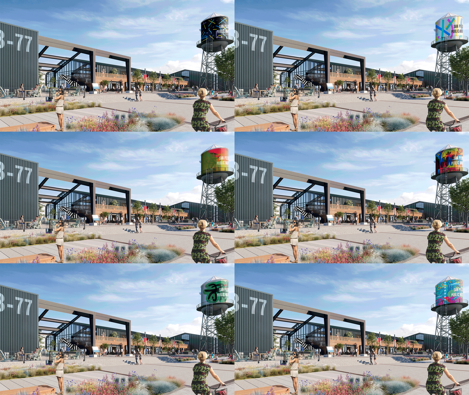
San Pedro Public Market had an existing water tower on their site. This water tower seemed like the perfect place to do something unique and creative that could act as a beacon to everyone in the area. It was big, tall, and well lit, and would be visible to people from almost anywhere on the site, and also from people driving by on the nearby freeway. As an art gallery, it would also create the perfect opportunity to feature local artists from the surrounding area and show the local community how much they are appreciated. The featured artwork would wrap around the entire water tower and would have the words “San Pedro Public Market” installed on top, which would be visible from the parking lot and the freeway. Ideally, the artwork would change every few months or so, which would breathe new life and creativity into the Public Market on a regular basis. That would also highlight the beauty and importance of diversity.
All the colors
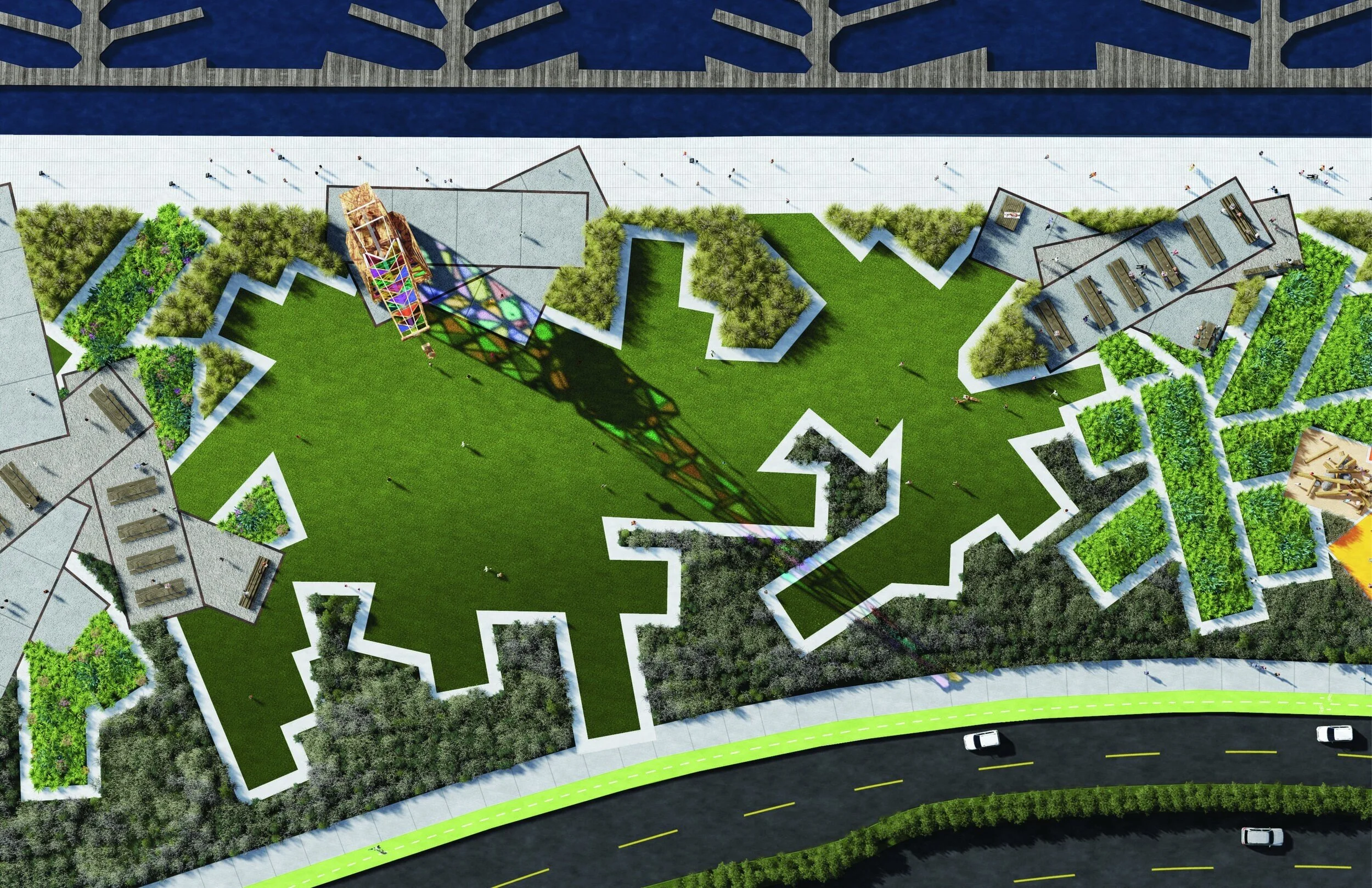
San Pedro Public Market also had an old crane on their site that wasn’t being used. As a way of breathing new life into that, I proposed that we use various pieces of colored acrylic to infill all of the openings in the crane’s framework. This would turn an old crane into another beacon that highlights the beauty and importance of diversity. The sun would pass through this colorful installation and give people the opportunity to walk through large fields of color that shine on the ground. This would be be an unforgettable experience and would make a lasting impression, prompting people to spread the word and come back for more.


