Summertime Magic
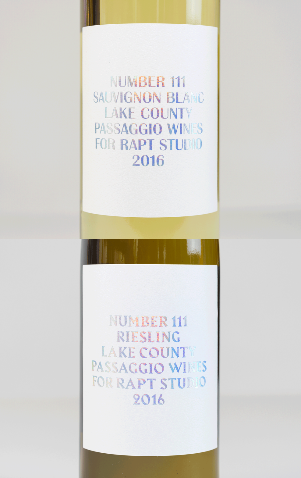
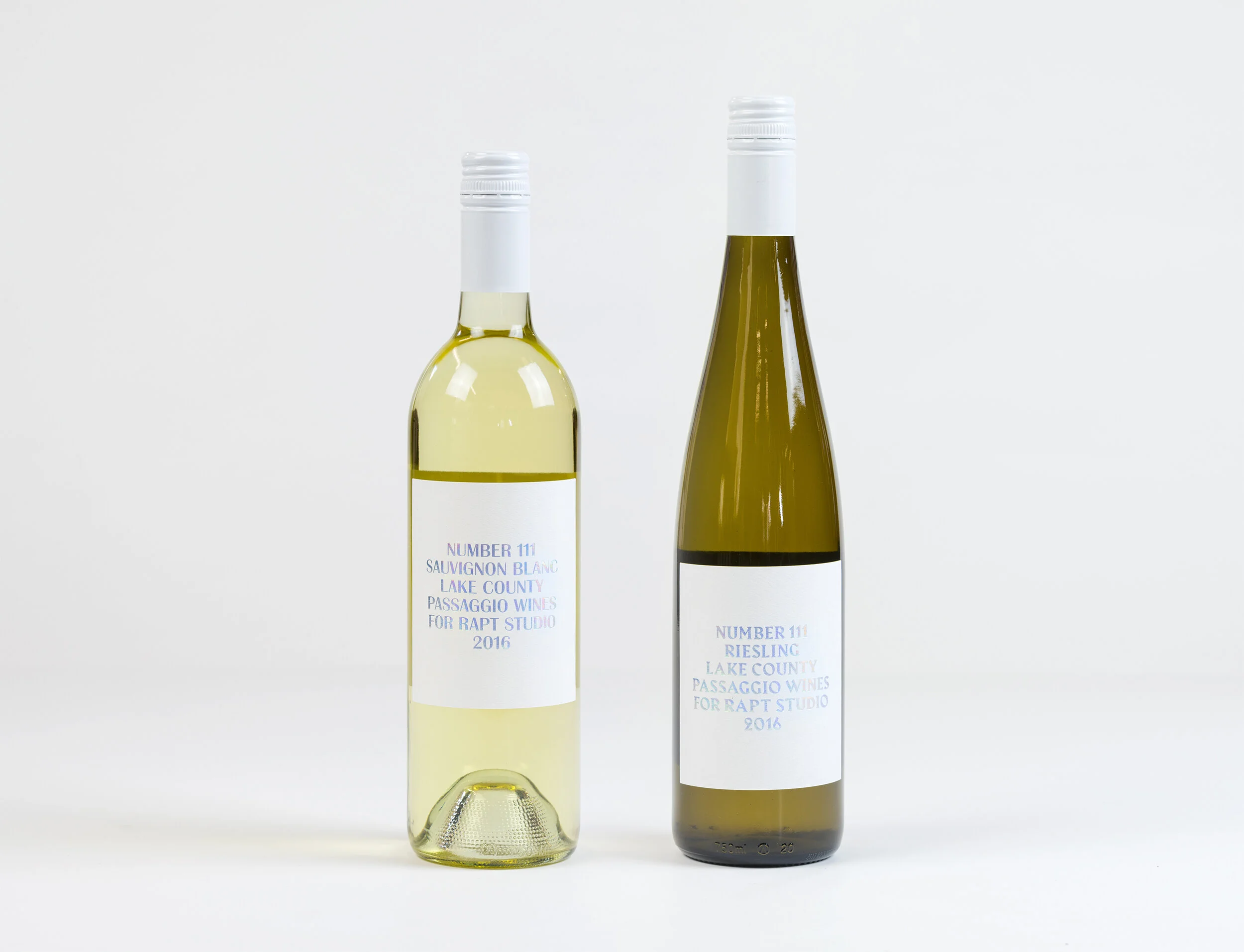
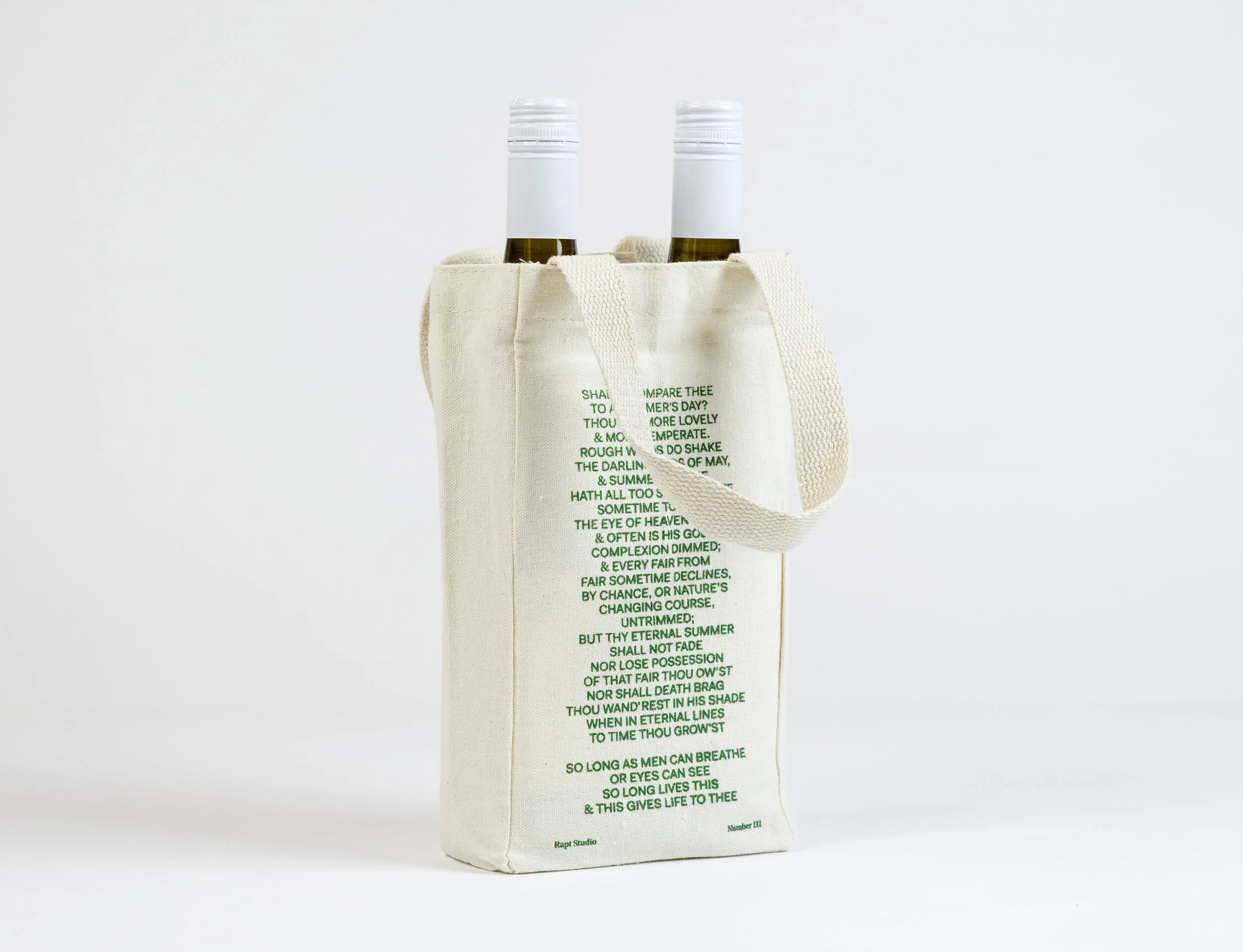
Wine labels designed for two custom wines that were produced for Rapt Studio. Each wine is paired with a unique font that complements the origin and personality of the wine, while the use of holographic foil complements the bright and colorful days of Spring and Summer, which is when these wines were meant to be enjoyed. The wines were packaged in custom printed wine bags and given to select clients.
Client: Various
Studio: Rapt
Creative Direction: David Gallulo
Art Direction: Sam Farhang, Sam Gray
Design: Chris Cowans
The Right Type
A unique font was picked that would highlight the origin and personality of each wine. Britannic was used for the Sauvignon Blanc and Harbour was used for the Reisling. Both wines have bright white labels, the same minimal layout, and holographic foil in order to create a simple and engaging summertime experience.
Custom Packaging
A canvas bag was screenprinted with a quote that evoked the feeling of a “mid-summer’s day” – each bag could hold two wine bottles.


